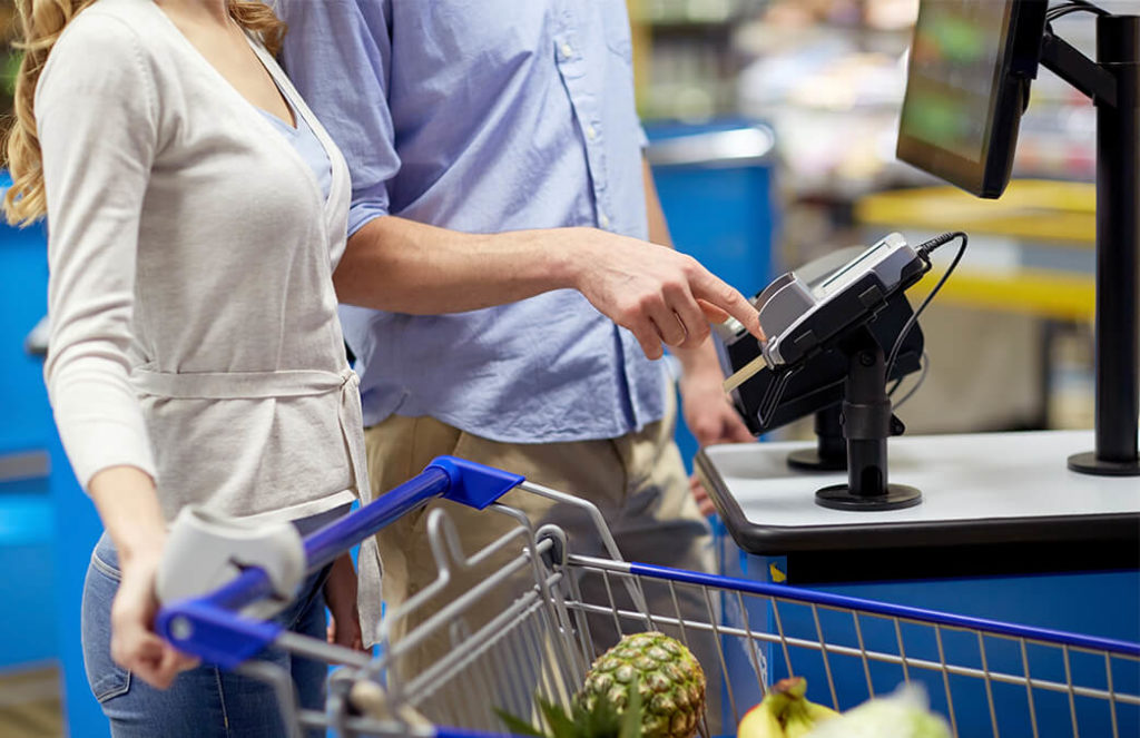
‘There is an unexpected item in the bagging area!’
We’ve all heard it. There’s nothing worse than feeling flustered at the self-checkout; trying to flag down a member of staff while searching for tomatoes on the vine… (why are they in the vegetable category, they’re a fruit!)
But despite our moaning, retail consumers continue to opt for kiosk over manned cashier. Just 10% of shoppers claim never to have used the machines, with 71% saying they use them because they find them handy when buying a few items and 61% saying it’s because they find them quicker.
Teamed with the cost savings incurred through a reduction in staff numbers (replacing a 4-6 manned checkout till with a single kiosk typically yields the same productivity) it’s clear to see that self-service technology is here to stay. So, with that in mind, what can we do to improve the experience, cut the friction and allow customers to leave feeling fulfilled and not frustrated?
-
Location
One of the most important things to consider before deploying a self-checkout solution is the location of the kiosks themselves. Getting it wrong can be one of the most expensive UX mistakes to fix as the installation will often involve ripping up floors and re-wiring. Placing the kiosks in the wrong place may also result in them not being used.
To find the right location you need to think carefully about traffic-flow through the store; where guests enter and leave, where your manned cashiers are and where bottlenecks happen. You also need to think about where to place customer lines. You will likely have one line for manned tills and another for self-checkout so you need to make sure that you not only have adequate space for people to congregate, but where you’ve asked them to queue won’t impact on other shoppers. By mapping out different scenarios within your store, you can make an informed decision about where your kiosks should be positioned and avoid any unnecessary relocation costs or staff and customer frustration.
-
Speed and ease of UI
If customers are opting to use a self-checkout kiosk they are doing so because they want speed of service, control, reliability and less social friction. But all too often in self-checkout scenarios, the user interface (UI) is confusing and clunky and a major pain point for customers.
Bad UIs do not consider user psychology and are modelled on the staff-facing point of sale which assumes familiarity. Good UIs, on the other hand, understand that most customers are seeing the screen for the first time. They take into consideration that there may be surrounding noise, and glare from overhead lights. They try to reduce as much friction as possible. Rather than stopping a transaction half way through to verify age, a good UI will ask for identification at the end of the transaction so as to not interrupt the flow. And they do this all while utilizing simplified screens, minimal text, clear typography and clean imagery.
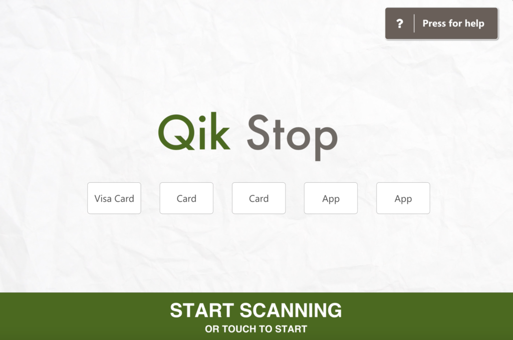
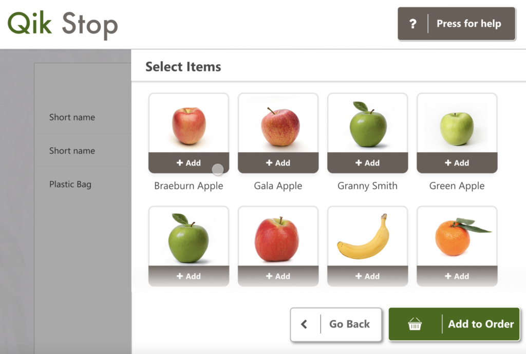
It’s important to make sure you’ve put in the groundwork research before developing your UI. You should know what your most popular items are, how shoppers tend to group their items, what percentage of your stock requires barcode input and last but not least, make sure to work with a UX/UI designer to bring it all together. Graphic designers, developers and engineers may have the know-how when it comes to building menus, but only a UX professional will be able to deliver a seamless customer journey that will both reduce frustration and empower the end use.
It’s also a good idea to get out there yourself and watch people using the technology once implemented, to better understand where the friction is coming from. Customers and staff have invaluable insights and should be your first point of reference when looking to understand pain points.
-
Peripherals
When it comes to the hardware within the physical kiosk, ie: the scales, the scanner, the printer and the cash dispenser there are a number of placement and functionality dos and dont’s that can make or break the customer experience.
Scales – The ‘unexpected item in the bagging area’ is reported as the biggest customer bugbear of self-checkout systems with 83% of customers surveyed by Viewbank in 2014 finding it annoying. With little proof that scales do a lot to reduce theft, many retail brands including Target have chosen to do away with them in favour of a better customer experience.
Scanner – Make sure it beeps! Have you ever tried to use a self-checkout kiosk with headphones in? Don’t, it’s really hard. Customers inherently rely on more than just their eyesight when interacting with this type of technology. And since we’re discussing visuals, it’s good practice to ensure your scanner has a laser light too. The scanner should stand out from the rest of the hardware and be brighter in colour than the main body.
Printer – Customers opting to use a self-checkout kiosk typically don’t have a lot of items, and if you’re making small, frequent spends it’s unlikely you’ll need proof of purchase each time. By making the printed receipt an option you’re giving the customer ownership, reducing your company’s carbon footprint, limiting printer hardware malfunctions and reducing the length of time the point of sale is out of action while paper is restocked.
Cash dispenser – On some hardware units the cash is dispensed very low down, away from the customers’ field of vision. In 2014 alone over £2.5million was left in UK supermarket kiosks this way. Help your customers out by reminding them to take their cash before they go, and by lighting up the cash dispenser. Nobody wants to return home from the grocery store to discover they spent $12.50 on milk and bread.
-
Staff
No matter how perfect your self-checkout strategy, there are always going to be instances where a member of staff is required to support a customer or tend to the equipment (paper re-stock, for example). To reduce friction, make sure you have ample staff manning the kiosks and there is a clear call for assistance system set up.
-
No line, no problem
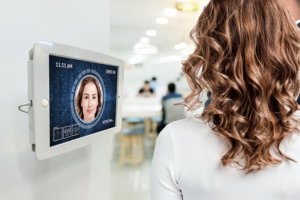
The future of self-checkout technology is set to be entirely frictionless with recent advancements in near-field communication and facial recognition. Amazon recently opened its cashierless store ‘Amazon Go’ to the public, which allows customers to walk in, pick up their items and leave without paying, or so it seems. In reality, the store uses cameras and pressure pad technology to track customer’s movements in store and deducts the cost when they leave via the Amazon Go app. A similar concept recently launched in China. BingoBox asks customers to scan a QR code on entry then uses facial recognition linked to WeChat and Alipay (the biggest payment providers in China) at the point of sale.
Back to the every day high street, we may be a good few years away from completely friction-less stores, but there’s a lot that can be done to reduce frustration at the kiosk in the meantime. If you take the time to understand you customer’s psychology, pinpoint the blockers, and react by making minor tweaks to your hardware, software and signage, you can make a big impact on the journey flow and ultimately your customers’ satisfaction.

