Mistake #1: Not getting your staff on board
It’s understandable that some of your staff might look at Hospitality customer self-service kiosks with some trepidation but as we explain in a previous blog, automation isn’t about replacing man with machine. Getting all your employees on board, from floor staff and management to back of house and kitchen staff, is key to making your kiosk deployment a success.
In the first few weeks of launch, staff should be fully trained and on hand to support and enhance the customer experience, encouraging guests to use the kiosks if they’re standing in a line and giving customers who are unfamiliar with the kiosk journey a helping hand, showing them how quick and easy they are to use.
All staff should be educated on the reasons and benefits of kiosk deployment, such as taking pressure of them during peaks times and allowing them to spend more time with guests who need or prefer face-to-face assistance. Managers should be given extra training on trouble shooting any issues that might arise with the kiosk for example, receipt paper change or rebooting. By giving your staff the knowledge and tools they need to not only accept but actively promote and manage instore kiosks, the more successful your deployment will be.
Mistake #2: Poor journey flow and ugly UI design
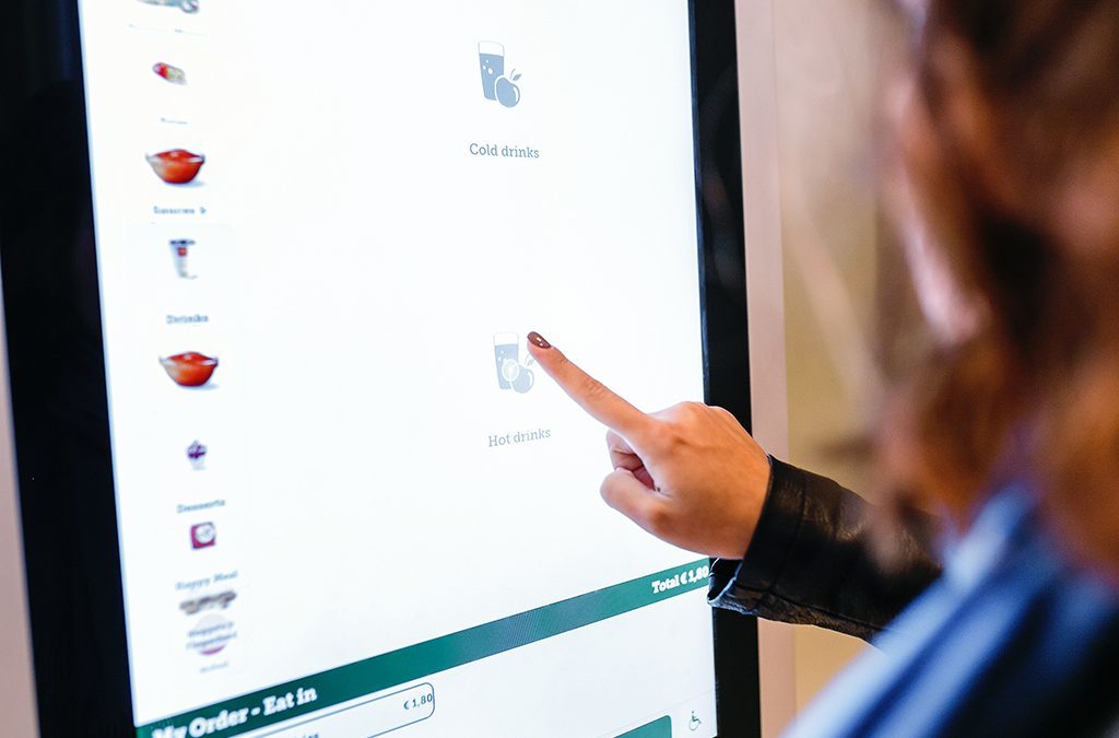
Many restaurants keen to walk hand-in-hand with their customers into the digital future have chosen customer self-service kiosks because of their potential to offer a differentiated, brand-specific, tech-focussed experience. But if you’ve not thought out the kiosk customer journey, look and feel, or considered how intuitive the process is, you might be doing your brand more harm than good.
Brands need to make sure that they use a provider who has design experience and keen UX skill in order to ensure the kiosk experience is on-brand and easy for the customer to use. Whether it’s help available through on-screen instructions, multi-language and currency, images rather than wordy descriptions, unambiguous or a short transactional process, all of these elements need to be carefully considered, and more importantly, tested, before you roll out across your estate.
One kiosk solution we’ve seen making its rounds is essentially a POS screen that has been ‘prettied up’ so customers can use it to order and pay for their meals. Unfortunately, the journey a server goes through when they use the POS is very different from the experience a customer wants and expects from a food ordering kiosk. By shoe-horning in a POS solution that isn’t fit for self-ordering purposes, again, you risk damaging your brand and losing customers along the way.
Related to the point above, UI design plays a key role in both the overall aesthetic experience for the customer and the ease with which they make their way through the kiosk journey. For example, tiny buttons, hidden instructions, confusing menu layout, hard to read font or a cluttered screen all impacts the impression your customers have of your brand. Not only that, it impacts the speed at which customers can order their meal and their overall experience.
Although Designrfix mainly talks about web design, some of their UI suggestions can be transferred to kiosk too. Their suggestions include:
- Good use of ‘white space’ to allow the eye to ‘breathe.
- Layout is part science, part art. You need to stand back and ‘feel’ it looks right as well as follow best practice formula.
- Guide your customers through the journey with good flow and intuitive menu navigation.
- Error messages are important – a bad one might lose you a customer, a good one might create forgiveness.
- Use colour wisely. Make sure they work together, they’re on brand and they make for easy reading.
Mistake #3: Bad kiosk positioning
If you’ve never deployed a kiosk solution across your stores, it can be difficult to know where the right place is to put them. However, it does need a good deal of thought because installing cables, power etc and ripping it all out and starting again isn’t just costly, its disruptive for staff and customers.
Think carefully about the traffic flow through the store, where guests enter and leave, where your existing counters and tables are, what furniture can and can’t be easily moved. Think about where current bottlenecks happen and how you can clear these by using kiosks to attract guests to different, more spacious areas of your stores. During peak times, if you have lines at the counter and lines at your kiosks, will this cause congestion or is there adequate space for everyone?
By mapping out different scenarios within your store, you can make an informed decision about where your kiosks should be positioned avoiding any unnecessary relocation costs or staff and customer frustration.
Mistake #4: Leaving your customer guessing
Your customer has browsed your menu, ordered and paid for their meal. Now what? Do they have to get a ticket and take it to the counter? Do they have to wait in a specific line for pick-up?
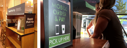
Don’t leave your customers guessing. Make sure there are clear instructions on the last page of the kiosk journey telling guests what they should do and where they should go. On top of that, position signage throughout your store that clearly shows where customers can pick up their meals.
Panera, for example has well-signed rapid pick-up areas for guests to go to retrieve their orders and likewise, Starbucks has something similar for their mobile order pick-ups.

All of these self-service kiosk worst practices can be easily addressed by making sure you have a solid, cross functional plan. By getting ops, IT and marketing involved and tapping into the expertise of your supplier, you can make sure your brand avoids any kiosk deployment pitfalls and instead has a solution that meets and even succeeds your brand’s digital ordering goals.


