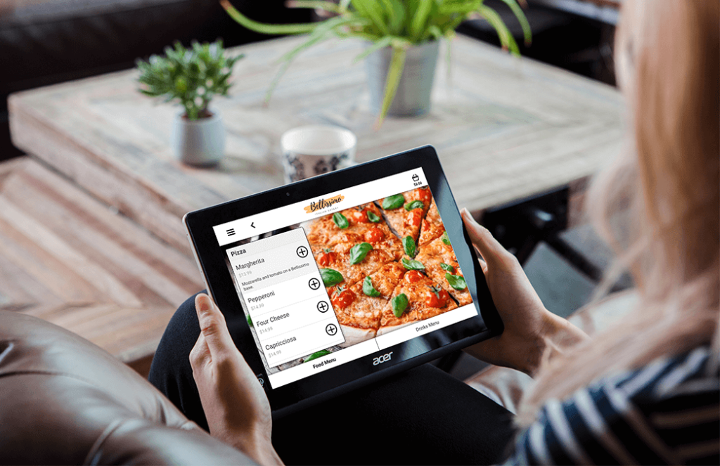
With digital ordering solutions on the rise, careful and clever menu design is more important than ever. Even small formatting adjustments in a restaurant’s menu layout can have a significant economic impact on customer purchasing habits. A good kiosk or mobile menu will boost the average transaction value (ATV) by 20% as standard, drive throughput, increase total transactions as well as really delight and fully engage your customers. With that in mind, here are five best practices for menu design to ensure your digital order and pay journeys are primed to boost sales.
-
Cross-sell and up-sell
One of the most valuable advantages to digital ordering solutions is the improved ability to upsell (“Would you like to upgrade your medium drink to a large?”) and cross-sell (“Would you like to like to add cheese to your burger?”). Due to a phenomenon called the digital disinhibition effect, customers are more likely to respond positively to suggestions of up-grades and add-ons from a virtual platform than from another person, since they feel more comfortable without another person waiting on them to decide what they want or judging them for ordering more. Prompt guests with options to upgrade or add-on at multiple points along the customer journey and see average checks boost.
-
Keep it simple
An important point to remember when constructing any menu is that simplicity matters. While it may be tempting to add as many customization options as possible given the limitless potential of digital ordering solutions, Hick’s Law says that decision time increases when more options are added. Similarly, the Paradox of Choice means that too many choices can cause more stress than happiness.
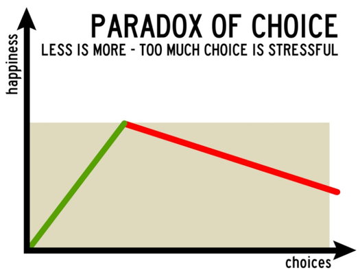
Everyone enjoys having options, but there comes a point when too many options become overwhelming and ends up causing stress. Psychologist, Barry Schwartz, found that more options leads to a higher abandon rate with customers deciding that – given too many options – the simplest option is to quit. Keep your menu organized and as lean as possible to gain maximum benefit from your digital ordering solution.
-
Keep it focused
When designing a digital menu for your customers, it’s important to focus the on-screen options as our short-term memory can typically store only seven items, plus or minus two. For this reason, try not to overwhelm your customers with a digital menu that contains ten or more options at any given point. Rather than forcing your customers to pick between 20 different meals, why don’t you try asking them to pick their protein from a list of seven options, then pick their side from a list of seven.
-
Practice Gestalt Principles on Top-Ticket Items
Gestalt Principles are a set of guidelines that lay out what types of arrangements are pleasing to look at. They also explain that people will naturally draw their gaze towards more satisfying designs.
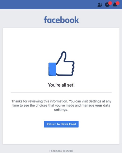
Take this page on Facebook for example. After updating your data privacy settings, Facebook loads a page that draws your attention towards one isolated blue button, labelled “Return to News Feed,” and towards two small red dots in the upper corner. The hope here is that this use of color and positioning will encourage you to click one of these icons, so that you continue to engage with their app.
The same type of design-oriented thinking can be applied to digital order solutions to encourage customers to consider a particular menu option, such as the option to upgrade to a large, or just to make the journey more enjoyable so that they interact longer and spend more.
-
Promote new offerings
One of the great advantages of a digitized menu is the ability to easily update offerings. This ability can be great for testing new products or special deals on your customers. For example, you could A/B test product pricings by selling your Cajun Cheeseburger for Price A at one location and Price B at another. Afterwards, data collection from your digital ordering platform would be able to measure which option would generate the greatest revenue.
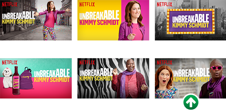
Netflix makes good use of A/B testing to rank preview images by their click-through rate. Here, by including a simple green arrow, the sixth image outperformed all others for the show Unbreakable Kimmy Schmidt.
A/B testing could also be used to experiment with different products, different names for the same product, or even different layouts for presenting your products. The opportunities are endless.
As brands increase the number of digital channels they have offering order and payment to their customers, more opportunities arise to use menu design to improve the guest experience and boost sales. By adhering to the design principles set out above, you can very quickly and simply make a few tweaks to your menu that can have a monumental effect on sales and the overall guest experience.

